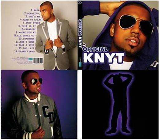
Our Album Cover
Our Website

www.wix.com/latymermediamv3/knyt
Tuesday, December 14, 2010
Q2 How effective is the combination of your main product and ancillary texts?
Our main product is the music video and we chose a website and album cover for our ancillary texts as these texts would be most likely chosen if this was a real marketing campaign.

As the music video would have been a debut music video for the artist, it was extremely important that the main focus was the artist. That is the main reason why we chose to keep a simplistic theme to the music video as we didn't want to distract attention away from him.
The use of the dancer provides something for the audience to look at and also provides links to the lyrics as the song is obviously about his love interest.
The main product does exactly what we wanted it to do; promote the artist as well as keep the audience interested. The overall look of the music video is stylish, sleek and modern which fits with the genre and appeals to our target audience.
Just like the music video, the main purpose of the website and album cover was to promote the artist and sell his music. By looking at the ancillary texts, it is easy to see how they work in synergy and the similarities between them.

Looking at examples of other websites and album covers, it is clear to see that the main focus has to be the artist. No record label will want to pay for a website, music video or album cover if their artist isn't promoted.
For example, Scorcher is a UK underground artist who is yet to become very mainstream. He is on the brink of getting signed and is therefore in the same "boat" as Knyt. Below is his debut album and it is clear to see that album is promoting him and therefore all the images are of him.

For our album, all the images are of him in different outfits and settings.


This packages him to audiences as not only an artist but as a brand; this brand is further enhanced by the store in which the audience can purchase t-shirts and hoodies with various “Knyt” related phrases on them.

The website has links to his youtube, twitter and facebook which gives the audience an opportunity to interact with the artist and therefore relate to him even more. It is adding to the cross marketing platform as it is a viral way for the audience to interact and our target audience is one that uses the internet quite a lot.


The increased availability of the internet across different platforms (PCs, laptops, mobile phones, game consoles) meant that the best way of marketing this artist was to use the internet as much as possible as it would be the perfect way to target our primary audience.
It can be seen on websites for other artists that the use of Twitter, Youtube and Facebook is very important.


The use of Facebook, Myspace, Twitter, Bebo and other social networking sites means that a much wider audience can be reached so on our website, we had icons on the side of the homepage which meant the audience could interact with the artist.
There is a colour scheme throughout the main product and ancillary texts which is black and white while the ancillary texts also have the colours silver and purple. This has created links between the media products. We also used the same font from the album cover on some pages of the website. This has created synergy and a brand identity for the artist.

The website has an introduction page where his logo comes up and his song plays. The home-screen of the website also has the music video on it and an image of the album cover. This not only promotes the album and the music video but creates a flow between the main media product and the ancillary texts.


I feel that we could have improved the links between the products by maybe using the logo in the music video and on the album cover. This would have created a better brand identity as the logo is something very simple for audiences to recognise. To be fair, we had originally wanted to put the logo on the album cover, however when we did that, it lowered the look of the album cover and made it look as if we had been too lazy to find a decent image.
Overall, I think that the combination of the three texts works very well as they all have the same “mood” of sleek and stylish as well as quite urban yet professional and I feel that our products could easily fit into the current music market.
- Labels: evaluation
- (0) Comments
Subscribe to:
Post Comments (Atom)

0 comments:
Post a Comment