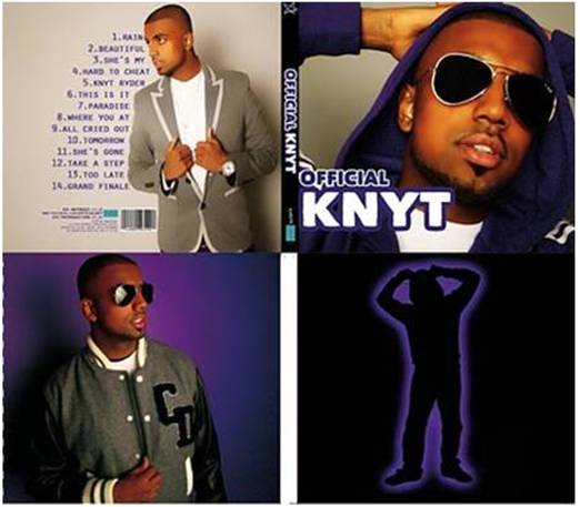
Our Music Video

Our Album Cover

Our Album Cover

Our Website

Our Website
www.wix.com/latymermediamv3/knyt

Tuesday, December 14, 2010

Q1 In what ways does your media product use, develop or challenge forms and conventions of real media products?

There are various forms and conventions of real R&B music videos and music videos of other genres. Some of these are shown in the diagram below:

Our music video uses and challenges many of the conventions in the diagram.

  • Showing off - black and white shots at the beginning of the music video highlighting the clothes, glasses, watch and shoes which is a typical feature in R&B music videos as there is usually a theme of materialism. This also links into the concept of "Focus on appearance of artist and extras"


  • Storyline - our music video challenges the concept of storylines in R&B music videos. A lot of R&B tracks are baout love and other life experiences, theefore they tend to have narrative in their music videos; however, more recent music videos focus on performance instead of narrative. Therefore we have developed this convention so that our music video can appeal to more modern audiences.
  • Simple concepts - I think we definitely used this convention. We wanted the video to be kept simple with a colour scheme of black ad white and the use of only one extra; the dancer.
  • Good-looking people - our music video has both a good-looking male and female so it therefore appeals to both a male and female audience.
  • Singer looking directly at camera - this is supposed to be his debut music video and therefore it is very important that the audience relates to him and are engaged. This is achieved by having him sing directly to the camera; directly to the audience.
  • "The Look" - R&B music videos almost always have "The Look" where the artist and/or the extras look directly at the camera which engages the audience. Our music video definitely uses the look.
  • Relationship between artist and others - the lyrics of the song indicate that he is singing about a girl so the fact that there is only one female in the video leads the audience to believe that he might be talking about her. This is helped by the fact that she is dancing quite provocatively which creates a sense of chemistry between them.
  • Performance - our music video definitely uses this concept; it is entirely performance-based which is quite unusual for R&B music videos as they usually have some form of narrative in them.
  • Narcissism and sexualised female, scopophilia - we DEFINITELY have used this convention as the styling and performance of the female makes her seem like an object. She appeals to both the male and female audience as males will want to be with her and females will want to be like her.
There are some other conventions of music videos that our music video uses:
  • Lack of continuity - our music video does not have any narrative therefore it has no continuity at all. Instead of editing shots to make a story 'flow', we used a variety of shots (close-ups, long shots, mid-shots) and two different colour backgrounds (black and white). There are also shots that cut to the beat.

  • Designed to be watched again - the use of quick cuts and the dancer has definitely made our music video interesting and makes people want to watch it again.
  • Genre characteristics - we definitely used this convention. The focus on the material possessions and the appearance of the artist and dancer is a characteristics of R&B videos. The sexualised female is also a major characteristic of this genre.
  • Close-ups and beauty shots of the star - the music video is mostly made up of shots of the star as we wanted to promote him and his music and make him the main focus of the video.
Here are some music videos that we took inspiration from. We used these videos as they are UK artist who started out in the UK underground music scene but have now become very mainstream.


To show that our music video stuck to most of the main conventions of real music videos, I have compared it to Andrew Goodwin's theory.

GENRE
The genre was R&B and I feel that this was made very obvious (our audience definitely picked up on it). The simplistic black and white and the sexualised female dancer which creates a sense of a love interest are usually found in R&B videos.

RELATIONSHIP BETWEEN LYRICS AND VISUALS
There are a few visuals that are used to illustrate the lyrics.
This is something that is found in music videos as it makes it easier for the audience to remember the song if they can link it to certain visuals in the music video.

It helps to make the artist more memorable as the audience may see something in everyday life that will make them relate back to the video.

RELATIONSHIP BETWEEN MUSIC AND VISUALS
We cut the video to the beat in some places and tried to keep the pace of the video constant throughout.
The black and white shots at the beginning go to colour when the melody of the song begins which creates an almost introduction to the artist and the dancer.

ARE THERE CLOSE-UPS OF THE ARTIST AND STAR IMAGE MOTIFS?
There are quite a few close-ups in our music video however we had planned there to be many more. However we found that we didn't have enough good footage and therefore couldn't put in as many as we had wanted to.

IS THERE REFERENCE TO THE NOTION OF LOOKING?
In order to have the audience engage with the music video, it was important to have a notion of looking. We have cut the beginning of the music video to look like the artist and the female extra are looking at each-other. There are also shots near the end of the music video that seem like he is looking at her again. We also made sure there were various shots of him and her looking at the camera and therefore looking directly at the audience.


IS THE MUSIC VIDEO PERFORMANCE-BASED, NARRATIVE-BASED OR CONCEPT-BASED?
Our video is definitely performance based but there is some concept of being successful and having a love interest. This is shown by having a dancing female in the video as well as showing off his possessions at the beginning of the video and having him wearing a suit throughout most of the video.


The one concept of Goodwin's theory that we challenge is intertextuality. Our music video doesn't have any references to other media products.

I feel that our music video did follow most of the conventions and did challenge some. It definitely has developed some conventions of early music videos as those videos usually contain some narrative and with little performance. Our music video is entirely performance-based in a completely white setting that gives it an almost "out of this world" look.


Q2 How effective is the combination of your main product and ancillary texts?

Our main product is the music video and we chose a website and album cover for our ancillary texts as these texts would be most likely chosen if this was a real marketing campaign.

As the music video would have been a debut music video for the artist, it was extremely important that the main focus was the artist. That is the main reason why we chose to keep a simplistic theme to the music video as we didn't want to distract attention away from him.

The use of the dancer provides something for the audience to look at and also provides links to the lyrics as the song is obviously about his love interest.

The main product does exactly what we wanted it to do; promote the artist as well as keep the audience interested. The overall look of the music video is stylish, sleek and modern which fits with the genre and appeals to our target audience.

Just like the music video, the main purpose of the website and album cover was to promote the artist and sell his music. By looking at the ancillary texts, it is easy to see how they work in synergy and the similarities between them.


Looking at examples of other websites and album covers, it is clear to see that the main focus has to be the artist. No record label will want to pay for a website, music video or album cover if their artist isn't promoted.

For example, Scorcher is a UK underground artist who is yet to become very mainstream. He is on the brink of getting signed and is therefore in the same "boat" as Knyt. Below is his debut album and it is clear to see that album is promoting him and therefore all the images are of him.

For our album, all the images are of him in different outfits and settings.

 This packages him to audiences as not only an artist but as a brand; this brand is further enhanced by the store in which the audience can purchase t-shirts and hoodies with various “Knyt” related phrases on them.
 The website has links to his youtube, twitter and facebook which gives the audience an opportunity to interact with the artist and therefore relate to him even more. It is adding to the cross marketing platform as it is a viral way for the audience to interact and our target audience is one that uses the internet quite a lot.


The increased availability of the internet across different platforms (PCs, laptops, mobile phones, game consoles) meant that the best way of marketing this artist was to use the internet as much as possible as it would be the perfect way to target our primary audience. 


It can be seen on websites for other artists that the use of Twitter, Youtube and Facebook is very important.


The use of Facebook, Myspace, Twitter, Bebo and other social networking sites means that a much wider audience can be reached so on our website, we had icons on the side of the homepage which meant the audience could interact with the artist.

There is a colour scheme throughout the main product and ancillary texts which is black and white while the ancillary texts also have the colours silver and purple. This has created links between the media products. We also used the same font from the album cover on some pages of the website. This has created synergy and a brand identity for the artist. 

The website has an introduction page where his logo comes up and his song plays. The home-screen of the website also has the music video on it and an image of the album cover. This not only promotes the album and the music video but creates a flow between the main media product and the ancillary texts.


I feel that we could have improved the links between the products by maybe using the logo in the music video and on the album cover. This would have created a better brand identity as the logo is something very simple for audiences to recognise. To be fair, we had originally wanted to put the logo on the album cover, however when we did that, it lowered the look of the album cover and made it look as if we had been too lazy to find a decent image.


Overall, I think that the combination of the three texts works very well as they all have the same “mood” of sleek and stylish as well as quite urban yet professional and I feel that our products could easily fit into the current music market.

Q3 What have you learnt from your audience feedback?

The most valuable feedback we got was from the screening we held at school. It was great because we easily got feedback from our primary target audience which were males and females teenagers/young adults and we therefore determine whether we had appealed to them in the right way.

From our initial planning, we had decided who our core market and the secondary market would be.


We also had a secondary target audience which were male teenagers/young adults and I feel that we didn't get enough feedback from them at the screening as there were only a few boys present.

However, I did ask males that I know who are in this demographic to watch the video and give some feedback.

This is the questionnaire we handed out to the audience in order to gain feedback:
There were quite a few trends in the answers given:


I think the dancer was the main thing that our target audience liked about the music video because they could relate to her as she is quite young and she appeals to their narcissistic pleasures. The male audience will want to be with her while the female audience will want to be like her.

It’s great that the audience compared Knyt to Jay Sean as this is the artist we took most inspiration from in terms of styling. Some people mentioned Tinchy Stryder which is who we took music video inspiration from.


During editing, I suspected that the audience would not like the smoke shots as we did not have a technique of how to use the smoke during filming and this can clearly be seen in the music video as the smoke just overwhelms him. This was the main negative point that most people wrote.

The audience also said that they would have liked to see more variety in shots and locations. I agree with this as we should have realised (as teenagers ourselves) that our target audience does get bored very easily. The fact that there are so many music videos available means that variety is necessary to keep the audience hooked and interested.

People who put down R&B as their favourite genre did say they liked the simplistic black and white theme as it made the music video look sleek and modern.


Through scopophilia (pleasure from looking) we have appealed to the male audience as we cut up shots of her body parts and over-sexualised her. The fact that the main character of the music video is a male could also give the male audience a sense of dominance which means they can relate to the video more.
It was extremely important to gain feedback on our ancillary products so we asked a few people.

Album Cover Feedback

Website Feedback

Overall, I think our audience feedback was extremely helpful because it let us know what we could improve as well as what we did well. Lucky for us, there weren't many things that they didn't like which makes me feel like our project was successful :)

Q4 How did you use new media technologies in the construction, research, planning and evaluation stages ?

New media technologies have been vital throughout this project as it has allowed us to do things that we previously would not have been able to do.

Without some of the new technology we used, our music video would literally have been a disaster. Various pieces of equipment and software have allowed us to produce a sleek, professional looking music video, album cover and website.

Research and Planning
Social networking sites and other websites such as Facebook, YouTube and Blogger have been a great help.


The group has been able to quickly communicate with each-other through Facebook and Blogger which was aided by the fact that we could access these websites via our mobiles. We were also able to communicate with the artist through Facebook.

YouTube provided not only inspiration but visual references that I could show the group to help them understand the ideas I had.

We quickly realised that there would be so much to do on the shoot so we asked two of our trust-worthy friends to come along and help us out. The use of Facebook meant that we could easily liaise with them and make sure they knew all the details of the shoot such as starting times, numbers of everyone involved and the locations.

Email was vital when contacting studios to hire. Convergence of technology made this process even easier as our mobiles have the ability to send and receive emails as well as Facebook messages. This definitely kept everyone in the group up to date with the goings on of the project.


Construction

New media technologies have really taken the forefront during this stage. As we wanted to create a glossy, modern music video, it was essential that the video was crisp and of high quality. This year, we were lucky to be able to use a Sony HD camera as it let us film in the high definition that we had wanted.

The camera let us change the focus of a shot manually by the simple turning off a scroll on the side of it. This meant that we could create variety in the shots.

We also wanted to have high quality images on the album and website so we used a Sony DS3H50 stills camera. By using this camera, we had high quality images that would stand out on the website and could be edited without worrying about low quality.

We also filmed the shoot for most of the day using one of the smaller Sony DV cameras which provided us with backstage footage used on the website.

The fact that we had hired out a studio for this project meant that we had access to professional lights as well as a smoke machine. 

The use of bright lights meant that the background came out whiter than it actually was and the smoke machine allowed us to create interesting effects.


However, we were quite inexperienced with the smoke machine which meant that some shots were overwhelmed with smoke and totally unusable.


We were unaware that to correctly light the set, we needed three lights; two on each side (which we had) and one at the back (which we didn’t have). If we had had three lights, it would have got rid of the shadows that caused problems when editing. It can be seen in the image bellow, exactly where our lights where in relation to the camera and how this cause there to be two shadows either side of Knyt.


Editing and post production
To edit, we were using the same software as last year which was Adobe Premiere Pro. I was very comfortable and familiar with this software, however using it to create a music video and an opening film sequence is very different.

This software was brilliant as we could use multiple tracks. This let us easily sync the footage of each camera set-up to the audio as well as create different effects.


This year, I learnt various new skills such as fade effects, how to edit the brightness and contrast, how to create a spit screen, using frame hold and Chroma Key.

Frame hold
The chroma key tool was by far the most useful tool as the walls of our studio were far from white and we had to use a white backdrop to film on. This left us with quite a big problem shown in the video below:

Adobe Premier Pro let us crop the video and add white layers to cover up the unwanted studio background. We then added brightness and contrast to make the black and white stand out. The chroma key tool then got rid of all the “white” background and replaced it with a proper white background. This got rid of the yellowness that appeared where the white layers and the footage background touched.

The software we used to create the album cover was Adobe Photoshop CS3. It let us airbrush Knyt’s skin in the images which made the album look more professional as artists are never seen with bad skin on their album covers.

We were also able to change the colour of his top and create glow effects. It was extremely important that his top was purple as we wanted it to fit in with the colour scheme we had already decided on. Although, he was wearing a purple top, the camera caused it to come out look blue. Luckily, Photoshop allowed us to rectify this problem.
before editing
The new website that we used this year was http://www.wix.com/ where we were able to create a flash-based website without needing any coding knowledge at all. I find website design to be one of my strong points and really enjoy it so I was excited to use this website. Wix is definitely really easy to learn and there are endless creative opportunities to explore.


We included features that most websites have such as videos, picture galleries and various interactive features.

I used Adobe Flash CS3 to create the logo seen on the introduction page. I have experience using this program and I feel that this software allowed me to create an interesting effect with the logo.

EVALUATION
In order to gain feedback from our target audiences, we used Facebook and YouTube.

We created an event on Facebook where we could invite people of our target audience to our screening. We made sure that the people we invited were serious and we could trust them to give us constructive criticism and be honest with us. 

YouTube allowed us to send the URL to people to get quick feedback online as well as reach a much wider audience. We have been able to gain a global audience with people even viewing in the Ivory Coast.

During our screening, we used the big interactive whiteboard screen, closed the curtains and switched off the lights. This created a nice mood in the room and meant that everyone could see the video and was totally focused on it. I think this definitely helped us in collecting good feedback about our video. We also showed them the album cover and website after the screening of the music video.

Overall, new media technologies have helped us greatly throughout the project as we have been able to push the boundaries of last year. We weren’t as limited as we were in the foundation project as there were so many new things we had access to.

Friday, December 10, 2010

All Done !

After so many weeks of hard work, we're finally done with the project.


There are things that we could improve but overall I feel that we've done extremely well and the finished products are brilliant.

I've posted about the finished website on the group blog with pictures of each individual page and descriptions of what they contain.

:D

Thursday, December 9, 2010

Homepage Dilemma

I love the way the website has come along and really happy with the techniques that have been used to make it look like a real, professional website.

The one page I did not like was the homepage:


I felt that it looked quite tacky and almost "myspace"-y. It had all the conventions of a real homepage but the composition and placing of the features wasn't consistent with the rest of the website. The homepage is the most important page of the website as it is the first page the consumer sees and will make or break a website so I was adamant that it be changed.

This is how the homepage looks now:


Although not a lot has been changed, it definately looks a lot better and is way more interactive.

Wednesday, December 8, 2010

Uhh ohh

We had thought the music video was done so we exported it and uploaded to YouTube. However, when we watched it on a different computer, the white was completely yellow in some places. Not even a faint yellow !

So we're going to go through the whole music video again and use the Chroma Key tool.

Hopefully this will make it better...

[UPDATE]
Yes ! The chroma key has fixed the problem so the music video is good to go !