Our Music Video
Our Album Cover

Tuesday, August 17, 2010
Album Cover Analysis
 1. What are the typical features that an album cover has?
- depending on the genre, they have an image of the artist.
- the artist name
- the album cover
- list of tracks on the back
- depending on the genre, imagery to do with the album
- name of album and artist on spine of album
2. How would you categorise the albums in front of you ? Are there any other ways of distinguishing between them other than generically?
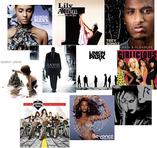
By looking at the covers in front of me, it is quite easy to seperate them into different genres; R&B, hip-hop, soul, rock and pop. You can also tell which albums are more recent by looking at the imagery on the front cover; currently the style of albums has become darker and more edgy.
You can also tell the target audience of the albums; the "Girlicious" album is hot pink with large black font and the artists on the front which appeals to teenage girls. The "Linkin Park" and "Coldplay" album are targeted at the male audience who are fans of the bands. While Rihanna's "Rated R" album is aimed at audiences who like her new edgy persona.
3. Album covers serve many different functions. What do you think these are?
In my opinion, the main purpose of an album cover is to sell the artist's music; it must look appealing and attract the target audience. Most albums (especially the R&B albums) use the artist on the front cover to promote the music. Other genres use art on their front covers.


0 comments:
Post a Comment